top of page
WWF Responsive Web Redesign
A more humanised experience for visitors of the website through optimised and interactive content
September - October 2018
My Role
User Experience, User Interface, Information Architecture
Team
Cassie Zoest
Keryn Christiansen (Lecturer)

The Brief
For this project we were tasked to design a responsive web concept for an existing non-profit organisation in New Zealand. We chose WWF. An important aspect of our chosen charity is their passion for bringing communities, individuals and governments together to create sustainable solutions for preserving our environment.
The Strategy
Our strategy was to simplify content where necessary as elements on the current website either just resize or get cut off completely which isn’t ideal. Other than optimising content we organised content in a more a logical way and in an order that makes sense to users. We also aimed to humanise the experience through the look and feel of the site.

Our main intention for this project was to redesign the current website in a more logical and engaging way to increase user traffic and retention.
As a starting point, we deconstructed the existing website.
The first problem we identified was the lack of a streamlined way of relating hierarchy back to importance in terms of site sections. WWF is globally known but we had surface-level knowledge of what they actually do. Thus, we wanted to emphasise their mission and goals to appeal to users from different age groups.
Our solution was to simplify sections, content and change copywriting a little bit to achieve a friendlier, more humanising tone. We kept the navigation sections to a minimum and merged related ones where necessary. Currently they have a section called 'What We Do' which we combined with About Us as most sites have this. We also included brief information about each section on the homepage.

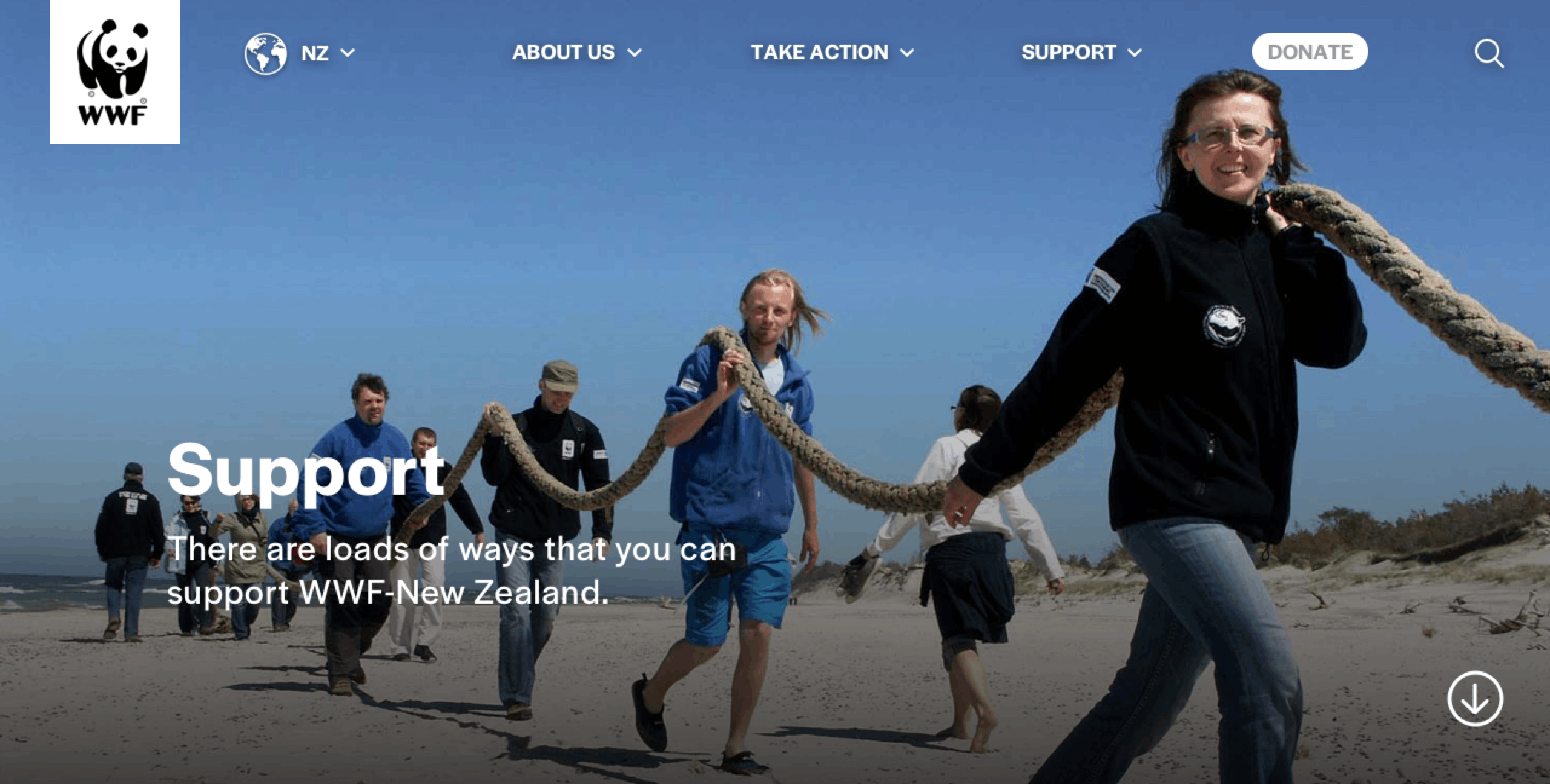
Navigation
Desktop
For desktop devices, primary navigation is displayed as a drop-down menu as users can hover over hyperlinks.
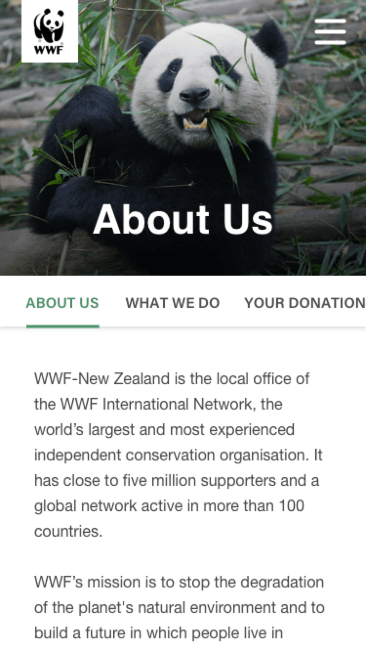
Tablet
Navigation accessed through a 3/4 hamburger menu to minimise clutter but still allow users to see the flow from page to page.
Mobile
Full screen hamburger menu to contain sections appropriate for mobile screen size.
Secondary Navigation
A horizontal scrolling tab utilises the drag function of touch devices, again minimising visual clutter from text.

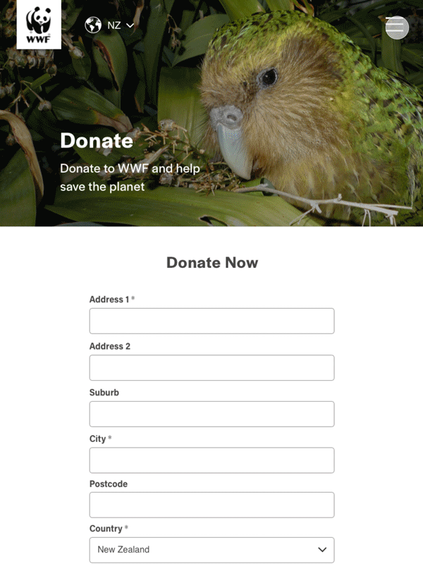
We made content interactive through 'modules' that allow users to reveal and hide information depending on how much they want to read.
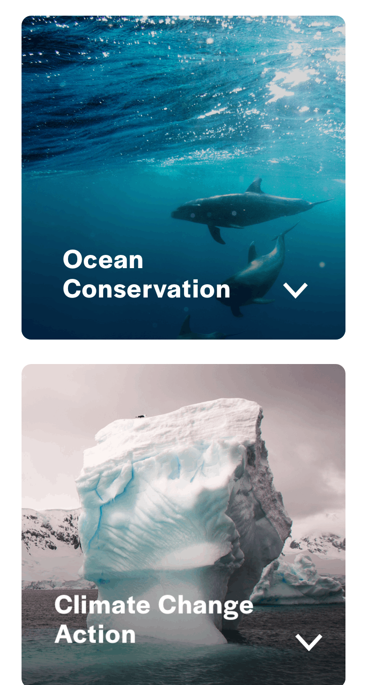
Because images are an important aspect of the website, our approach in making them compatible for all three screen sizes was to follow a basic 3-2-1 grid where images go from rectangles that go from edge to edge to stacked squares with modules that contain what information is hidden on mobile.
This makes accessing reports and statistics easier and more interesting. For the subsections under Ocean Conservation, clickable images turn into simple text buttons inside the collapsible module on mobile to save space, allowing users to see all of them at once instead of scrolling down.
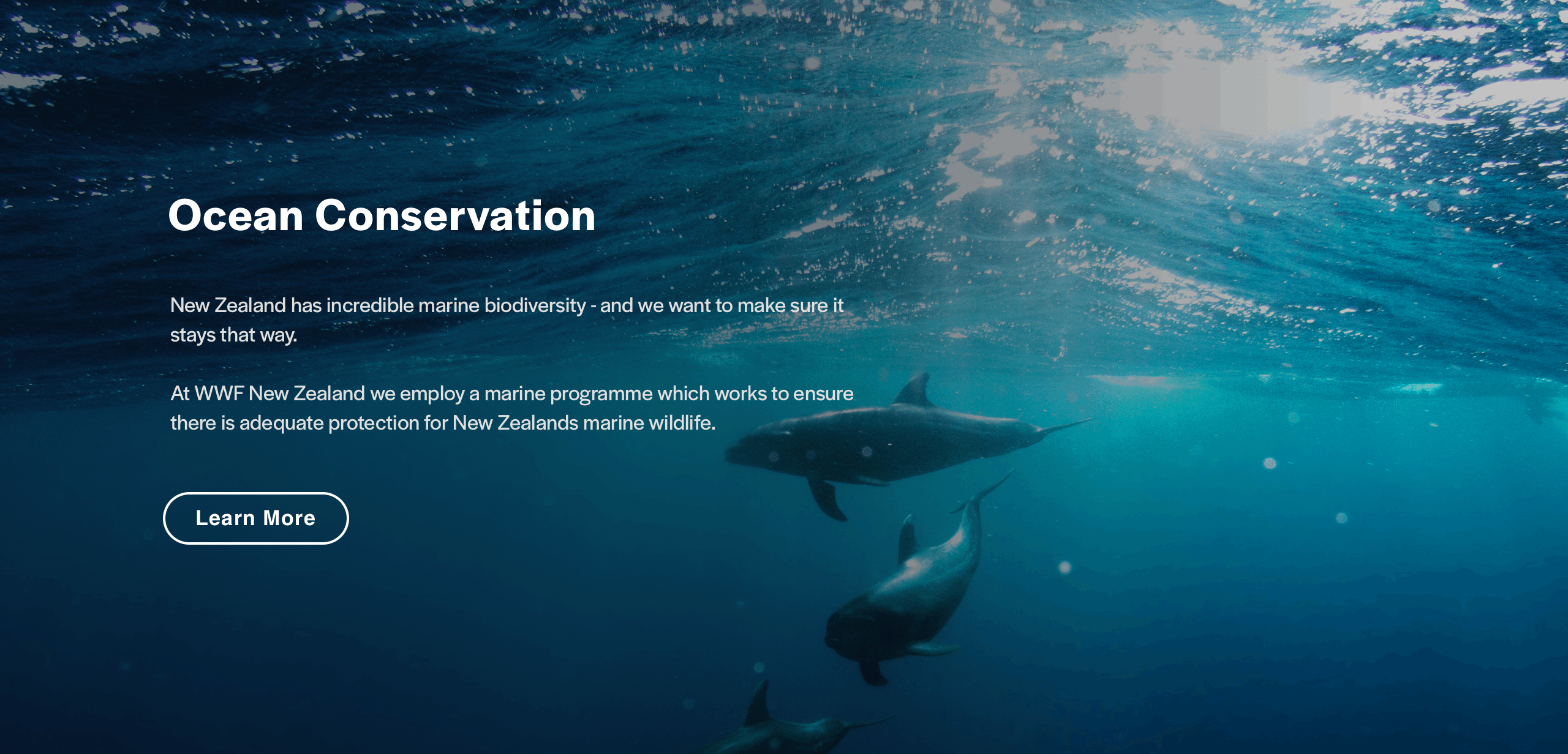
Desktop and Tablet
Displays title and body text, users can interact by clicking 'Learn More'
Mobile
Displays title only, user clicks to expand to show body text, then they can interact
Previous Project
Next Project
bottom of page